Project 03 / 05
GoTyme Savings
GoTyme
GoalSave
Saving is not a feature.
It is a habit that needs a place to live.
Role
Product Designer
Platform
iOS & Android
Market
Philippines
Initiative
TymeX
Status
Shipped
Most savings products are built for people who have already decided to save. GoalSave was built for the moment before that — the gap between wanting to and actually doing it.
The premise
The Philippines has 70 million active mobile users and a deep, informal culture of saving.
People save.
They just don't save in banks.
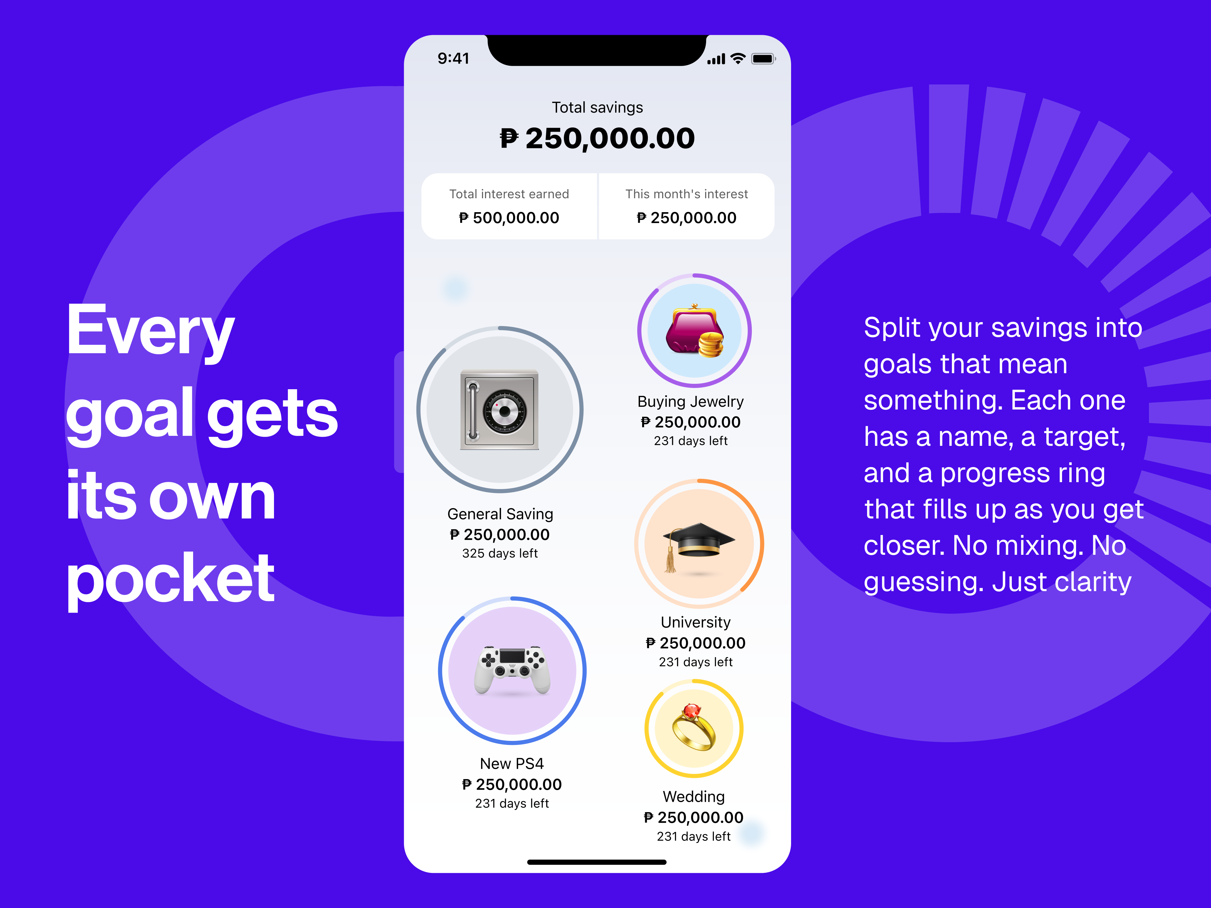
GoalSave is a goal-based savings account inside the GoTyme Bank app. Name a goal. Set a target if you want. Let the system handle the rest.
Up to 9% annual interest. ₱0 to open. Three ways to save — Auto-Save, Save the Change, or just deposit when it feels right.
The gap
People don't fail to save because they lack tools. They fail because saving requires a decision every single time.
Opening a savings account is easy.
Remembering to put money in it is hard.
Saving competes with everything else money is doing. Rent. Groceries. The unexpected expense. The thing that feels more urgent right now.
Every time someone opens a savings app intending to transfer something, life has usually already spent it.
This is not a literacy problem.
It is not a design problem.
It is a timing problem.
And timing problems don't get solved with better interfaces. They get solved by removing the need for timing altogether.
Every extra step is a reason to not save.
So we removed the steps.
Three quiet truths
A goal without a name is easy to abandon.
When savings live in a generic account, withdrawing feels neutral. When the account is named “School fees for Mia,” the same withdrawal feels like a small betrayal.
That is not a design trick. That is just how people work.
One decision is easier than fifty-two.
The users most likely to reach their goals are not the most disciplined. They are the ones who automated early and never had to decide again.
Willpower is a terrible savings strategy. Systems are better.
Progress that says nothing fails silently.
A progress bar at 60% tells you where you are. It does not tell you if that is enough.
Users who fall behind don't always give up. They just stop opening the app, because opening it started to feel bad.
How it works
The system has three layers. Each one saves differently. Together, they keep going even when you forget.
01
Creating a goal
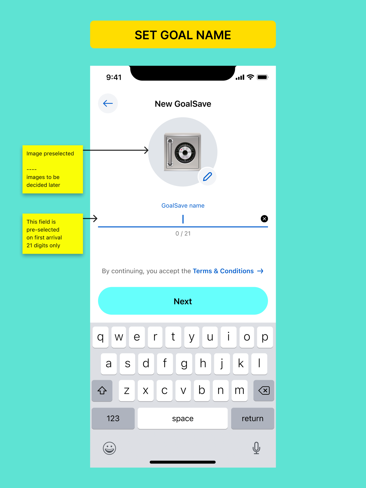
The first screen doesn't ask how much. It asks what for.
Name it. Choose a photo. By the time you reach the numbers, the goal already feels like yours.
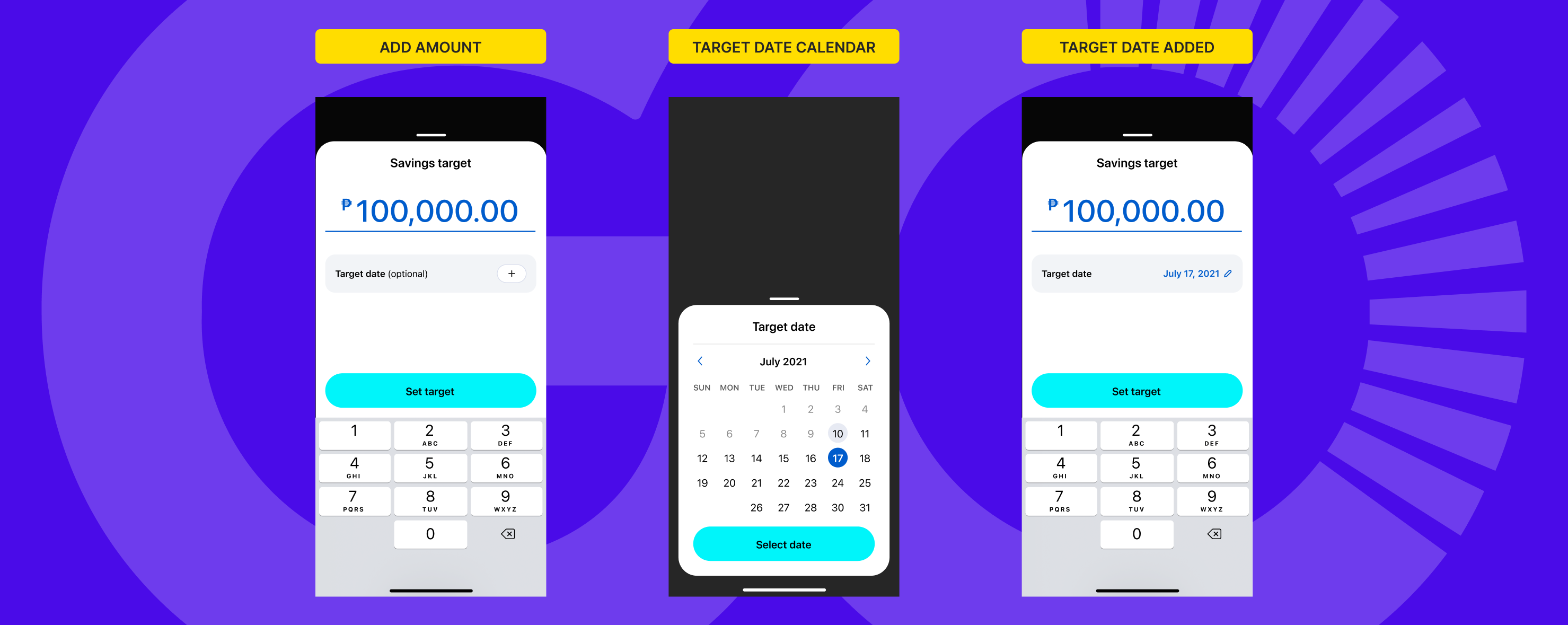
Target and deadline are optional. A goal can start as nothing but a name. Structure comes later, once the idea is real enough to commit to.
Asking for a number before someone has decided what they want is asking the wrong question first.
02
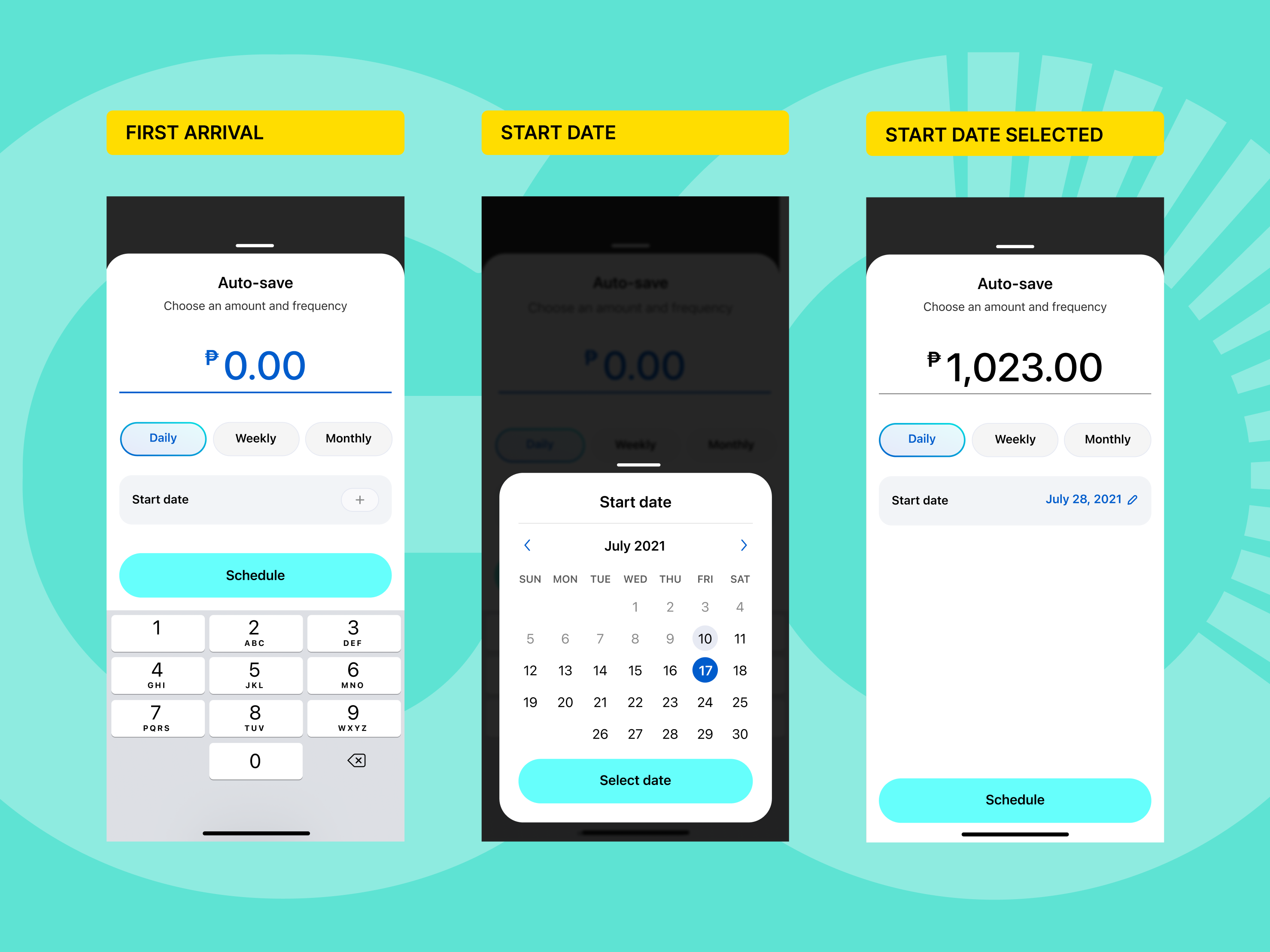
Auto-Save
Set it once. Daily, weekly, or monthly. The money moves on its own.
If a target and deadline exist, Smart Save calculates the exact amount needed and suggests it. You confirm or adjust.
If the transfer fails — insufficient balance, bad timing — the app doesn't ignore it. It asks: “Want to try again?” That's the entire response.
03
Save the Change
A ₱47 coffee becomes ₱50. ₱3 goes to savings. No action required after setup.
Saving becomes a side effect of spending rather than a separate act. Round-up amounts can be set to the nearest ₱1, ₱5, ₱10, ₱25, or ₱50. Smaller amounts feel effortless. Larger ones start to feel like real progress.
Save the Change connects to one goal at a time. Redirecting it requires a conscious choice. That one extra step keeps awareness alive.
04
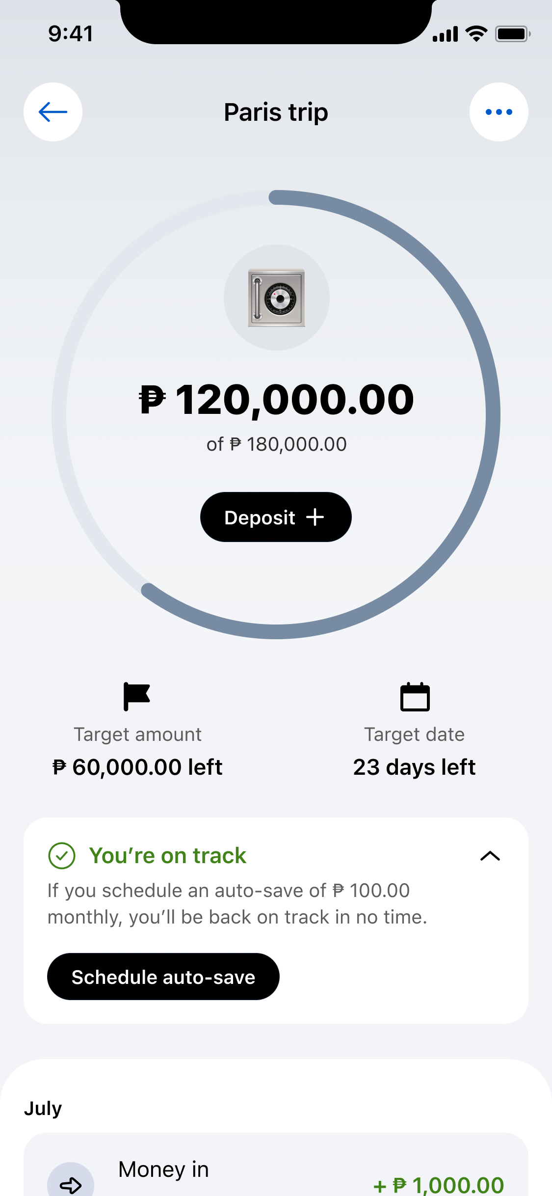
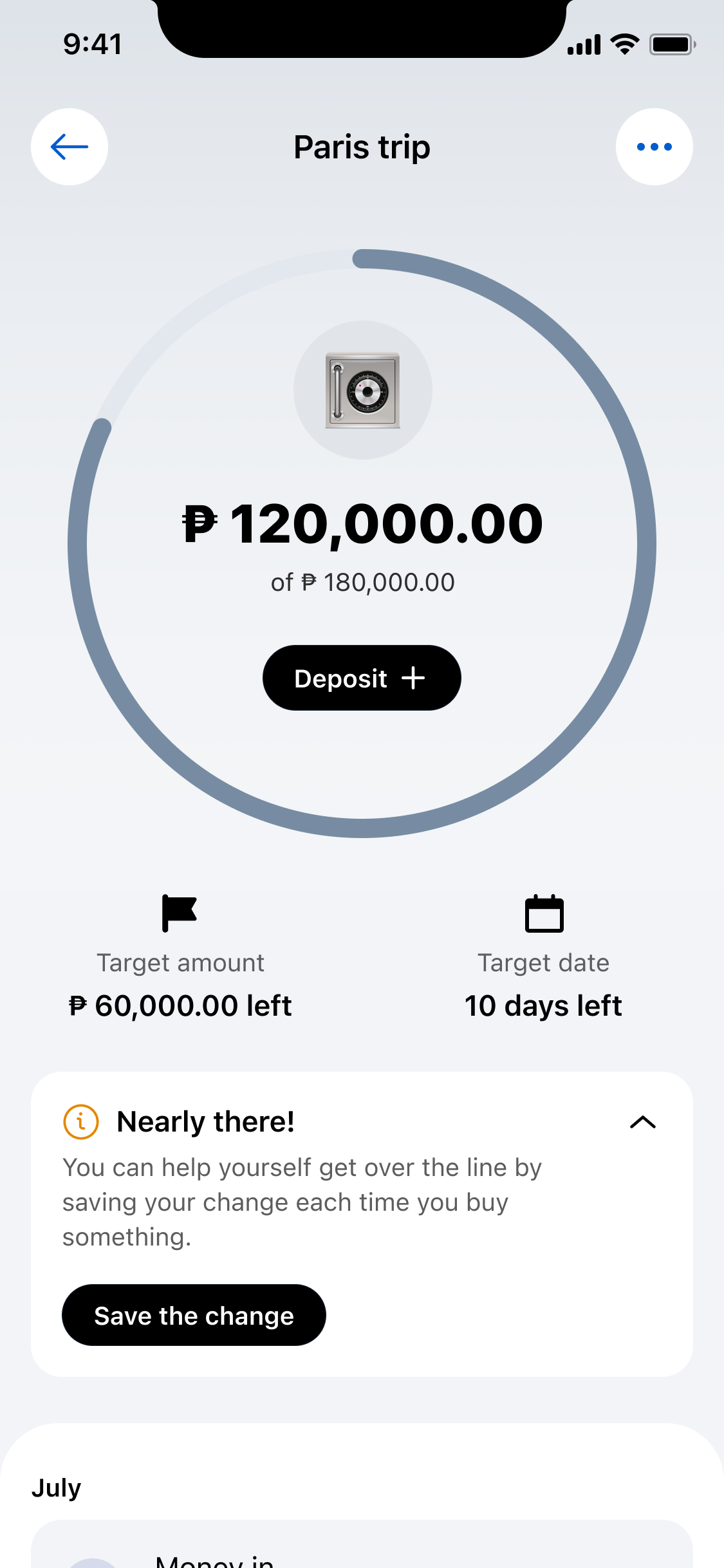
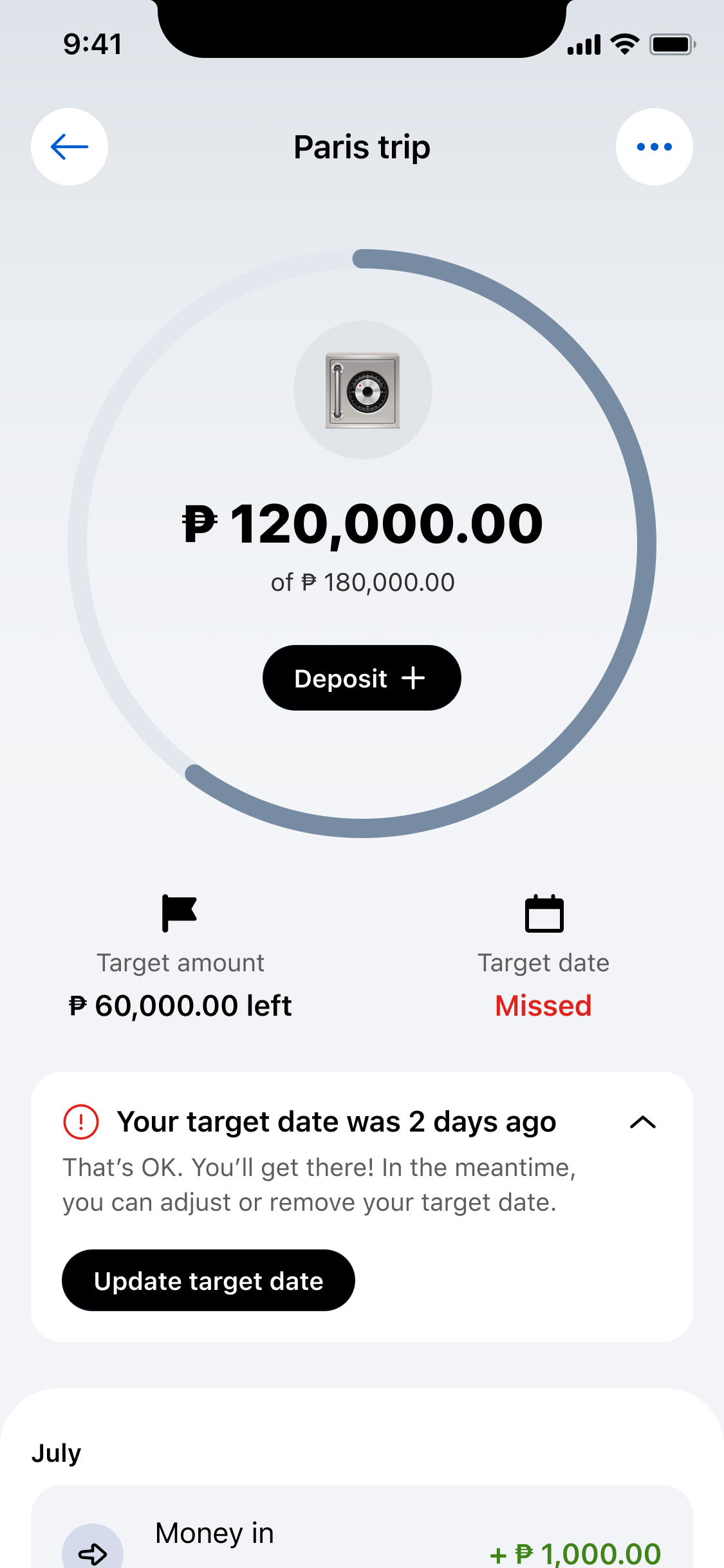
Twelve states of progress
GoalSave does not show a number and leave you to interpret it. It tells you where you stand — and what to do next.
On track? It affirms without over-celebrating. Close to the finish line? It suggests a specific action to cross it. Missed the deadline? It acknowledges what happened and offers a way forward.
The tone mattered more than the UI. “You're behind” feels accusatory. “That's OK” feels hollow. Finding the line between honest and encouraging took more iteration than anything visual.
What changed
The most significant shift was not in the feature set. It was in the mental model.
Previous savings products asked people to manage money. GoalSave asked them to name something they wanted and then stepped out of the way.
There is a real difference between those two things.
In a market where distrust of formal banking runs alongside a genuine desire to save, GoalSave was not asking users to trust a bank. It was giving them a tool to exercise the discipline they already had.
What I carried forward
Designing for behavior is different from designing for function.
On progress states
The most time-consuming part of the design, and the most underestimated by everyone outside the team. A progress bar at 42% means nothing without context. Is 42% good? Bad? Normal for this point in time? Investing in those twelve states meant the dashboard always had something useful to tell the user, not just something to display.
On the paluwagan
The deeper I looked at why informal savings groups work in the Philippines, the more it changed how I thought about product defaults. The paluwagan works because the commitment is structural, not motivational. You don't rely on feeling like saving. The system relies on you.
On tone
Writing the off-track states was harder than designing them. The language had to acknowledge reality without shame. Finding that line took more iteration than anything visual. That surprised me.
On what's next
Social savings was not something we built. But shared goals — two people saving toward the same target, with visibility into each other's progress — that's the paluwagan's most powerful mechanic. I haven't seen it done well in any digital savings product.
Most people who wanted to save already knew how. GoalSave just made it harder to stop.