Project 02 / 05
TymeBank Crypto
TymeBank
Crypto
South Africa's first regulated bank to offer crypto trading inside its own app. Built for people who had never bought a coin.
Role
Product Designer
Platform
iOS & Android
Market
South Africa
Integration
Paxos API
Status
Shipped
TymeBank partnered with Paxos, a US-regulated crypto infrastructure provider, to handle custody, settlement, and compliance in the background. The task was to make all of that disappear: a banking experience that happened to let you buy Bitcoin, not a crypto product bolted onto a bank.
At a glance
The Product
A crypto buy/sell feature embedded natively in TymeBank's mobile app. Users can trade Bitcoin, Ethereum, Litecoin, Bitcoin Cash, Paxos USD, and Paxos Gold, funded directly from their TymeBank EveryDay account, starting from R50.
The Challenge
TymeBank's core users are not crypto traders. Many had never bought digital assets. The product had to work for someone unfamiliar with wallets, custody, or coin pricing, while satisfying FSCA regulatory requirements and Paxos integration constraints.
What I Designed
The full buy/sell lifecycle: discovery on the home screen, story-format onboarding, coin selection and detail, amount entry with live balance impact, order confirmation, success state, and all error and edge-case flows. On iOS and Android.
Paxos Integration
Paxos handles all custody, settlement, and compliance infrastructure. The UX never surfaces this. Users interact entirely with TymeBank's brand, design system, and account data. The abstraction was intentional: users trust TymeBank, not an unfamiliar US fintech.
Context
A digital bank, a new asset class, and a market that had no clean route in
TymeBank is South Africa's first fully digital bank: branchless, mobile-first, and built around affordability. Its core base includes first-time account holders, the newly banked, and people whose primary financial interface is their phone.
In 2020 and 2021, South Africa had one of the highest crypto adoption rates on the continent. But the access path was fragmented: offshore exchanges, separate apps, manual bank transfers, and pricing in USD. There was no clean route for someone who wanted to buy R500 of Bitcoin from their salary account on a Tuesday afternoon.
TymeBank saw the gap. Partnering with Paxos allowed them to embed custody and settlement infrastructure without building it themselves. The design task was to put TymeBank on top of all of it, so the user would see one thing: their bank, letting them buy Bitcoin.
R50
Minimum purchase
6
Coins available at launch
1st
SA licensed bank with native crypto
2
Platforms: iOS and Android
Problem
Crypto isn't complicated to use. It's complicated to trust.
"I don't know what happens to my money after I press buy. Does it leave my account? Can I get it back?"Mass-market banking user, pre-launch
The User Problem
TymeBank's core demographic had not bought crypto before. For many, this would be a first exposure to digital assets. The product had to work for someone who doesn't know what a wallet address is, has never seen a price chart, and isn't sure if buying Bitcoin means they could lose access to rent money.
The Regulatory Problem
South Africa's FSCA mandated explicit risk disclosure before any trade. Age verification at 18+ was non-negotiable. Biometric identity checks were required before a user could access crypto. These weren't optional guardrails. They were legal requirements that had to be embedded into the flow without making it feel like a compliance exercise.
The Integration Problem
Paxos prices are live and indicative. Settlement happens at confirmation, not entry. The price a user sees when typing an amount may not be the price they transact at. This is true for every crypto product, but it had to be communicated clearly to users who had no prior context for how crypto settlement works.
The Product Problem
Too simplified and the product feels dishonest. Too detailed and it becomes a compliance document dressed as an app. The balance was not between beginner mode and expert mode. It was about putting the right information at the exact moment it was needed, and withholding everything else.
Insight
The trust problem lives in the amount field
Users understood the concept of buying crypto. They hesitated at the moment of entering a number. Not because of complexity, but because they couldn't see what would happen to their bank account.
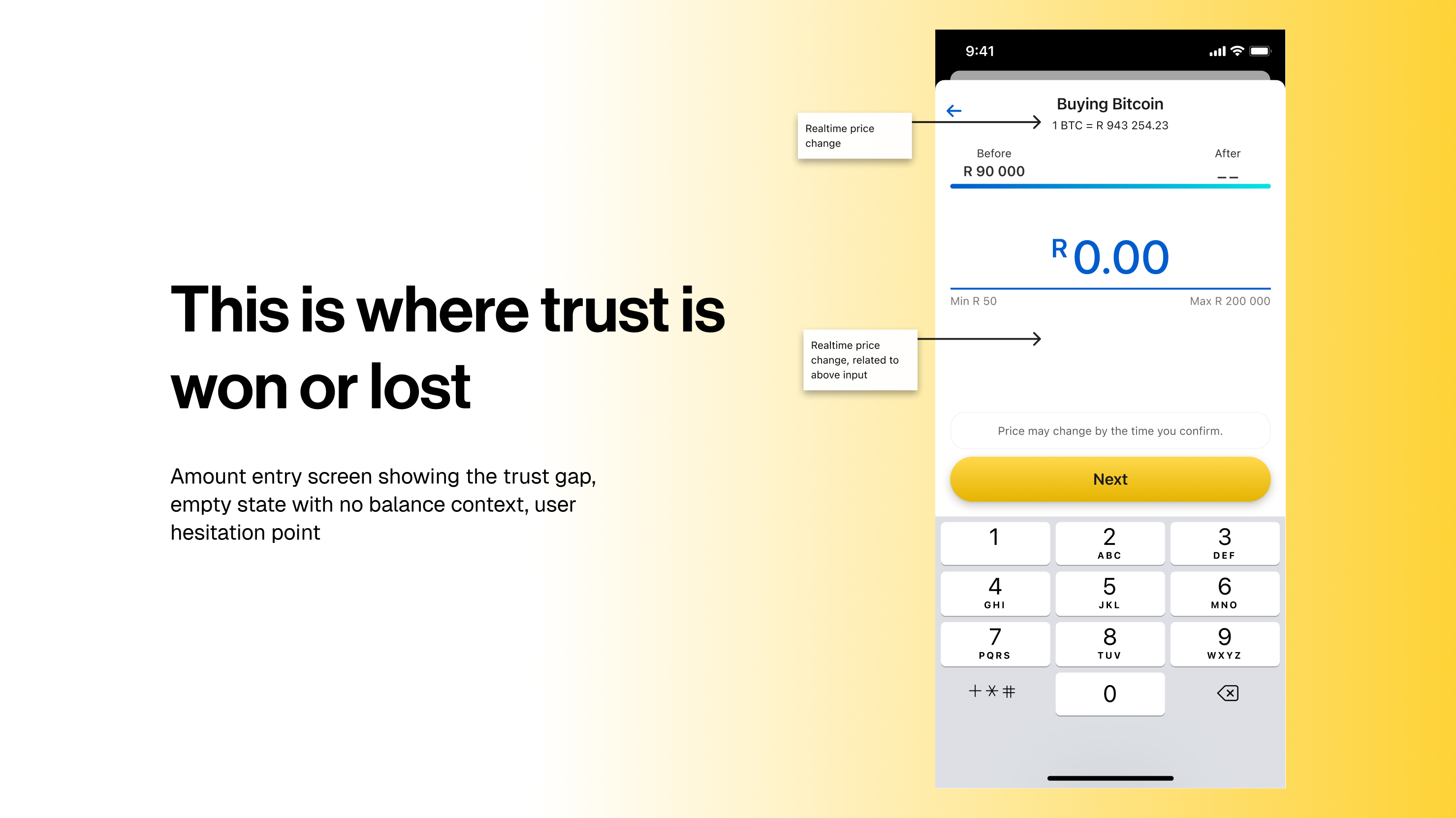
Where Abandonment Actually Happened
Users got through the onboarding stories. They selected a coin. They tapped Buy. Then they stopped at the amount screen. The anxiety was not about crypto. It was about their bank balance. They didn't know how much would leave their account, or when, or if they could reverse it.
This meant the onboarding screens, no matter how well-written, could not solve the trust problem. The trust problem was transactional, not educational. It needed to be resolved inside the buy flow itself, at the exact moment the user was most uncertain.
The First Purchase Is the Only Metric That Matters
Getting someone to make a first purchase, even R50 of Bitcoin, was more important than designing for active traders. Portfolio management, advanced chart timeframes, and coin switching were all available. But they weren't the conversion lever. First-buy completion was.
This shaped every priority: reduce friction at the amount screen, surface balance impact before commitment, set honest price expectations, and make the confirmation screen feel like a receipt, not a risk disclosure.
Decisions
Four calls that shaped the experience
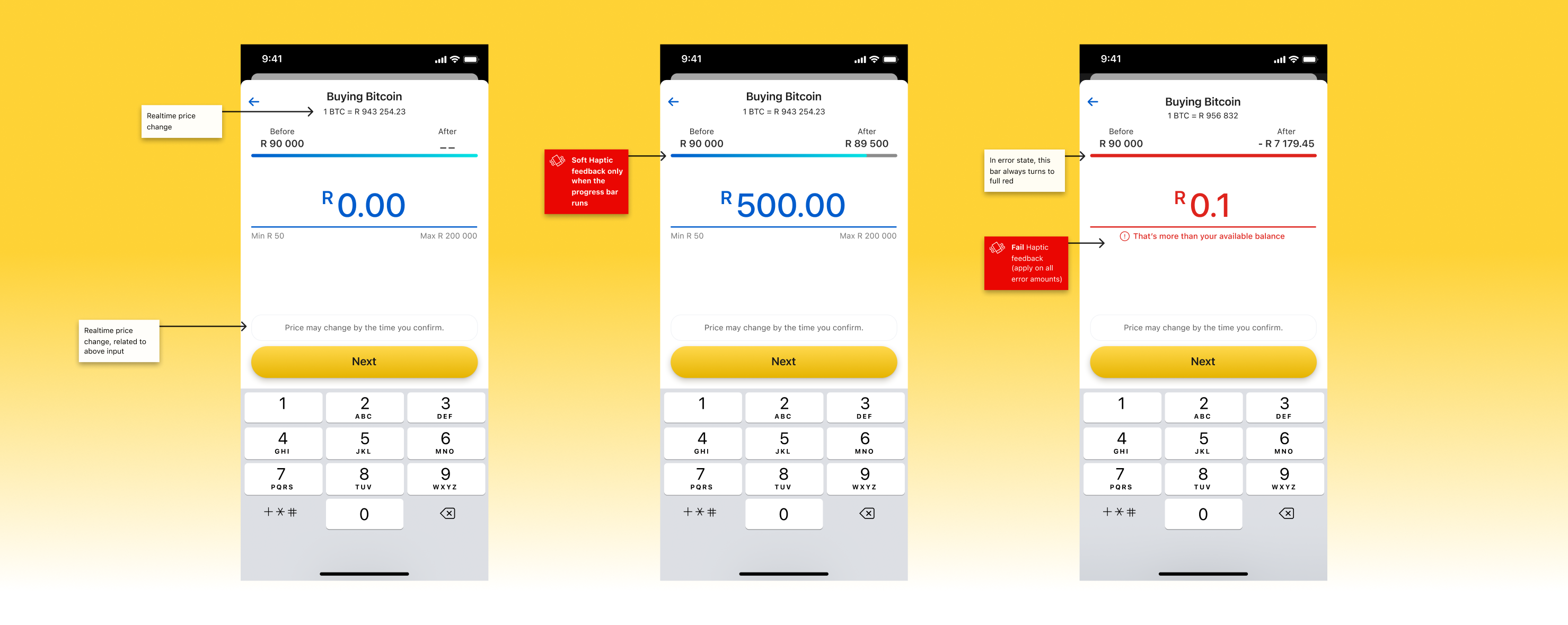
The balance bar instead of a warning
Observation
Warning messages about insufficient balance appear after a user commits. They punish intent rather than informing it. The real anxiety isn't about making a mistake. It's about not knowing what's coming before you decide.
Decision
A persistent "Before / After" bar sits at the top of the amount screen and updates as the user types. Before pressing any button, they can already see how their balance changes. Impact moves from post-error to pre-decision.
Trade-off
The bar had to be prominently placed at the expense of screen real estate in an already constrained mobile layout. The amount input and keyboard take up most of the viewport. Compact but legible, with no room to negotiate.
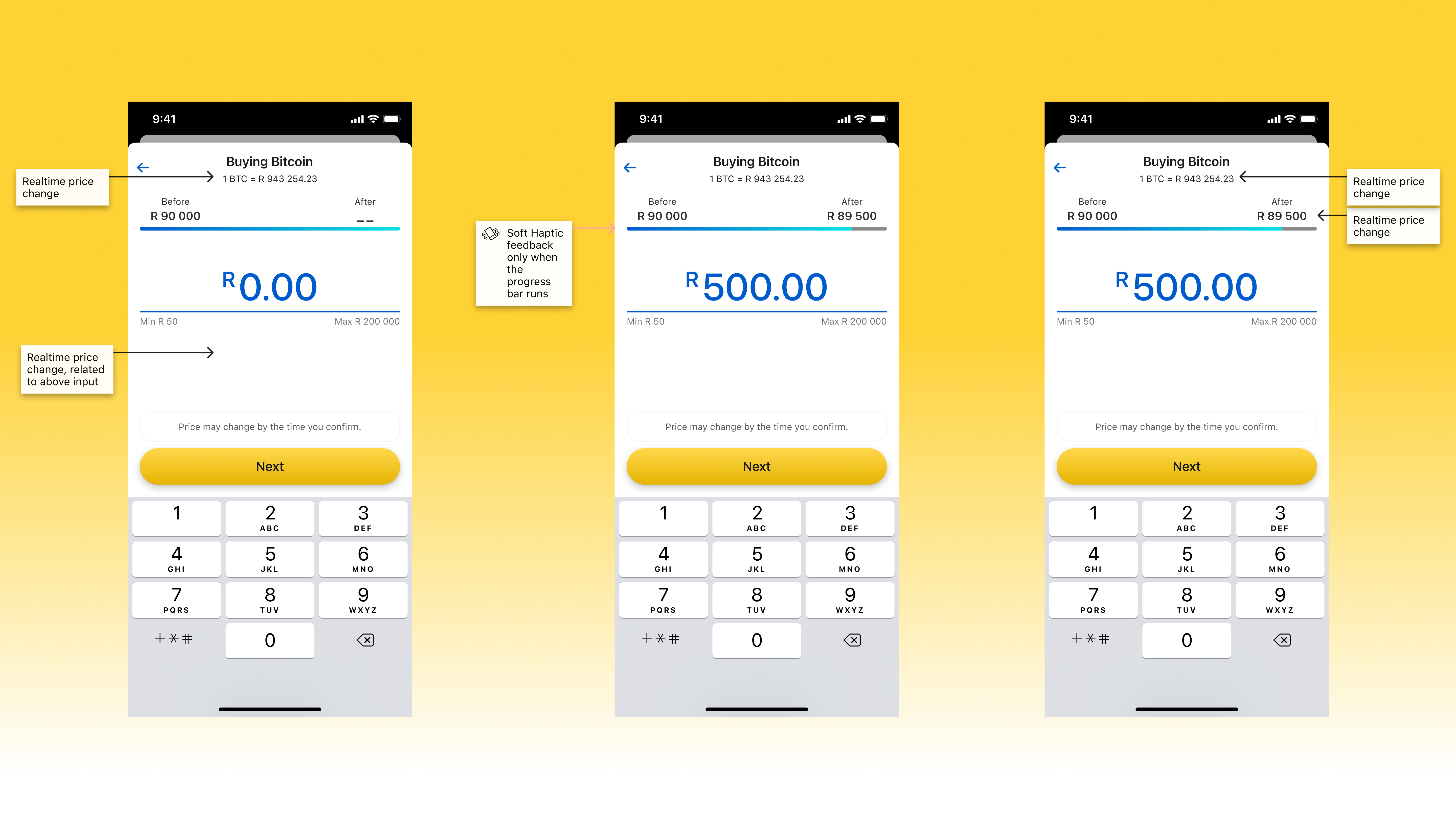
Live price with an honest disclaimer
Observation
Crypto prices move. Showing a live price and then transacting at a different price feels like bait-and-switch to users who don't understand indicative pricing. This is a structural feature of crypto settlement, not a product decision. But it had to be communicated as if it were one.
Decision
The current price ("1 BTC = R 943,254.23") is shown prominently in the navigation bar, visible throughout the flow. A persistent disclaimer below the amount input reads: "Price may change by the time you confirm." The price is live. The transaction locks at confirmation. Both are true.
Trade-off
Some users interpreted the disclaimer as uncertainty or unreliability. The phrasing had to be neutral enough to set expectations without creating anxiety. "Price may change" is softer than "price will change" but still honest.

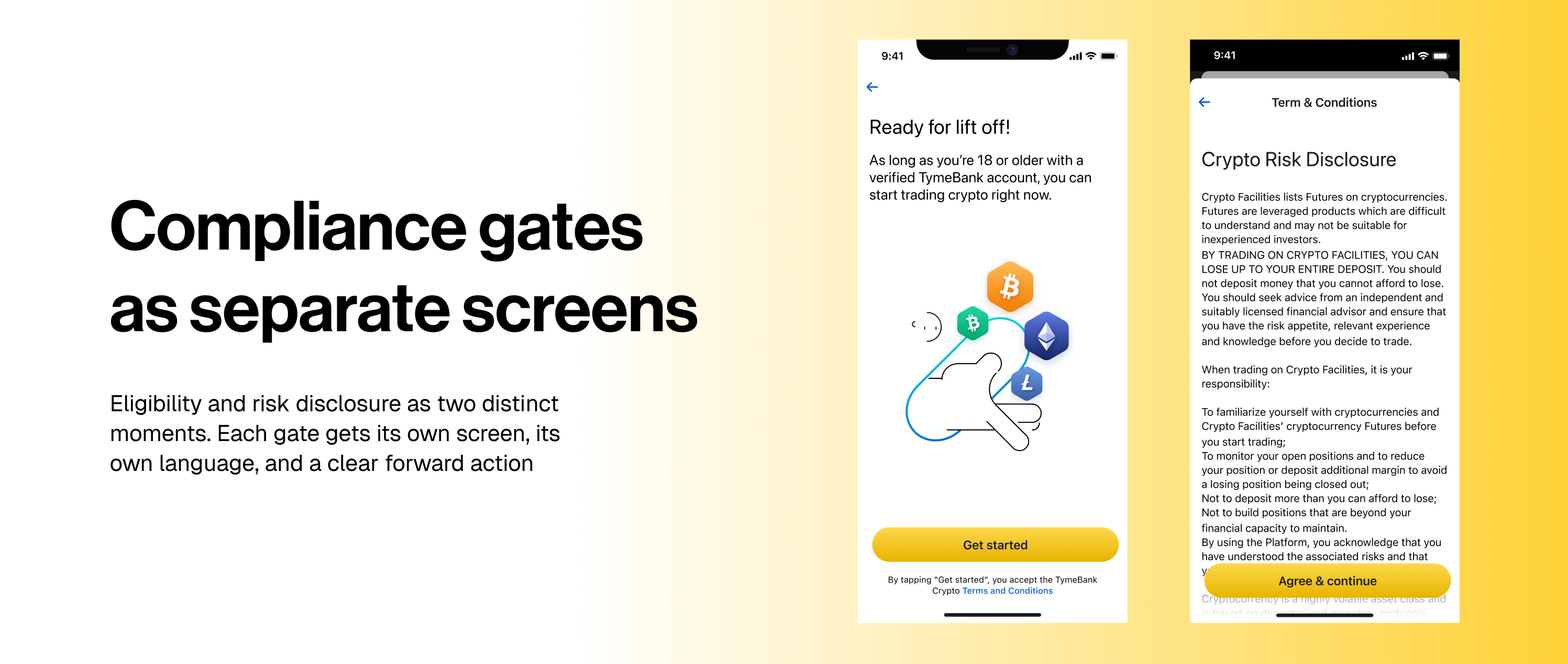
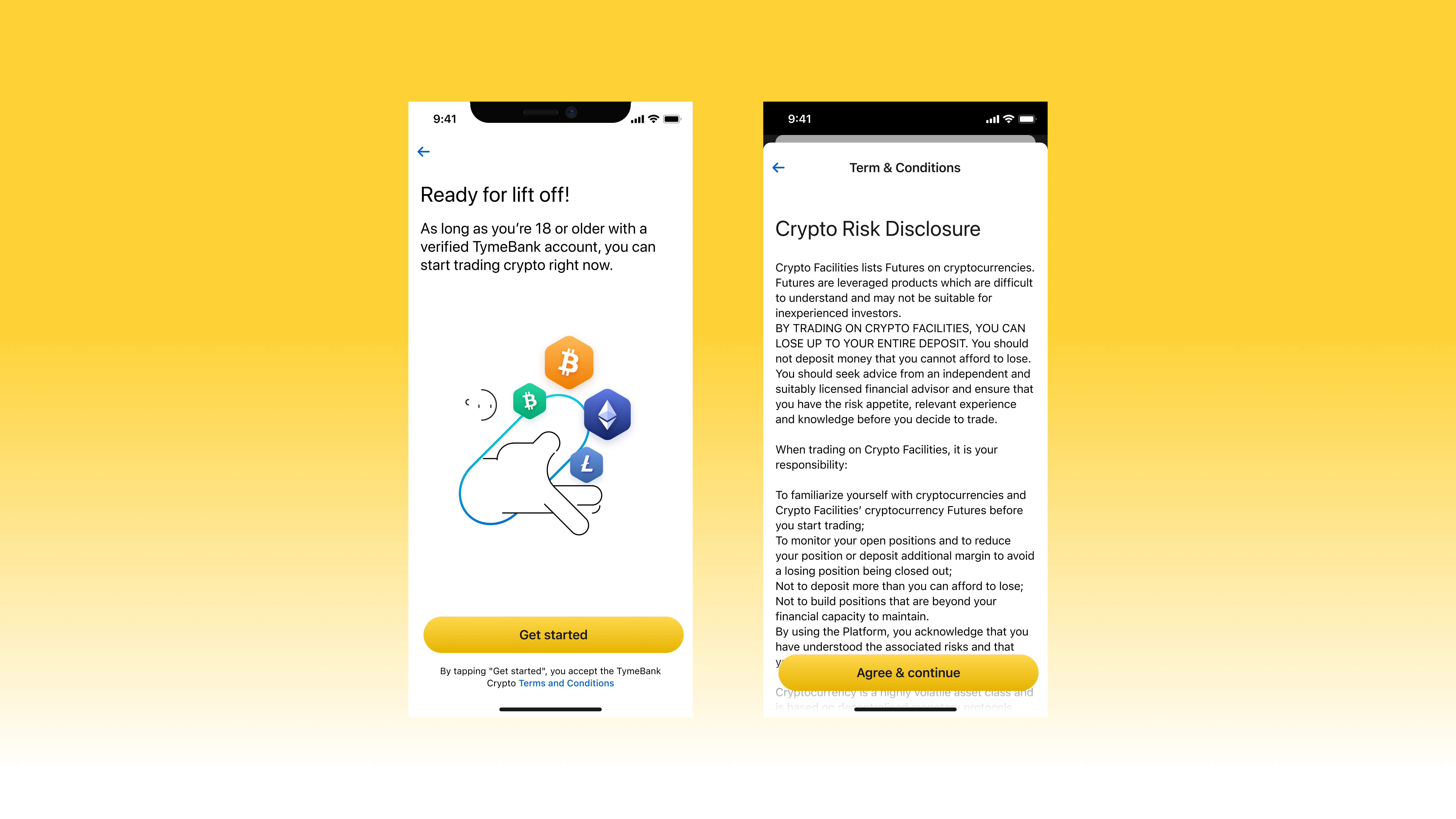
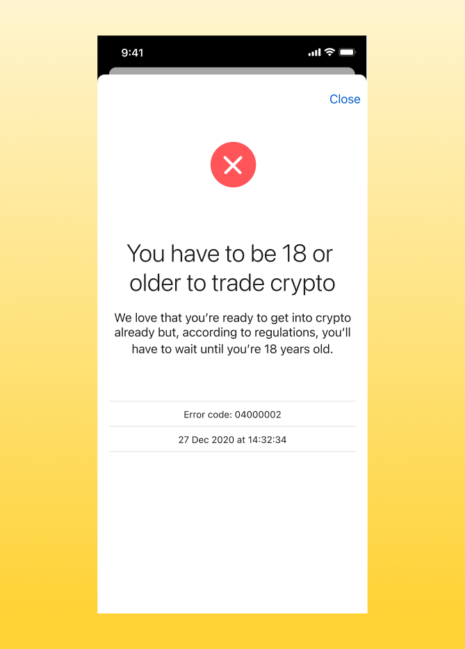
Compliance gates as separate screens
Observation
Bundling age checks, identity verification, and T&C acceptance into a single pre-entry modal is standard practice. It also means users encounter all three barriers at once, before they understand what the product does or why they want it.
Decision
Each compliance requirement is handled as a distinct screen with its own explanation. An under-18 user sees: "We love that you're ready to get into crypto already, but according to regulations, you'll have to wait until you're 18." An unverified user is told exactly how to fix it, in-app selfie check or kiosk fingerprint scan, with a direct CTA. Error codes appear for support escalation.
Trade-off
Separating gates into individual screens adds steps to the ineligible-user path. The bet was that context-appropriate explanations would reduce support contacts more than consolidation would reduce friction.
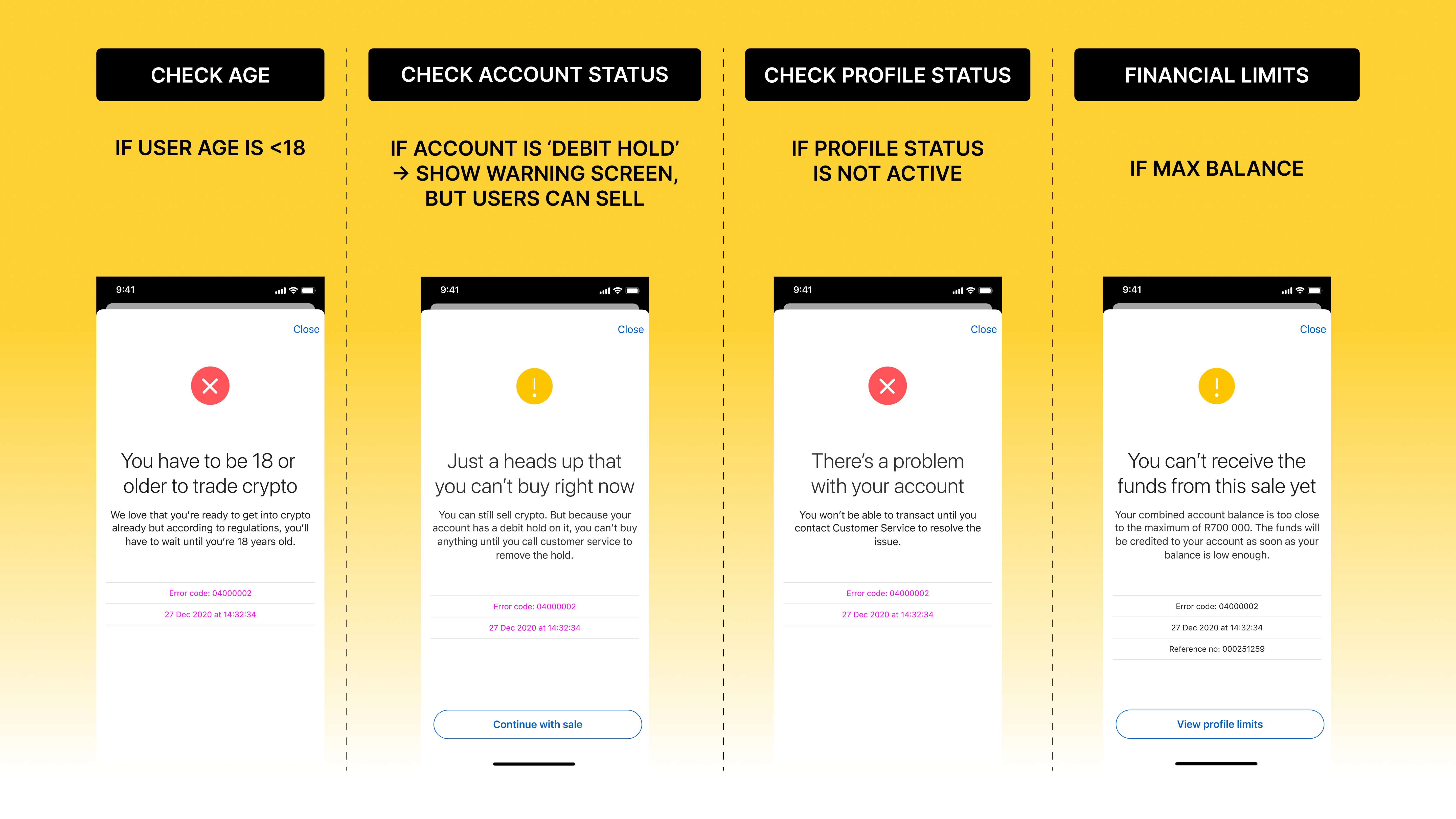
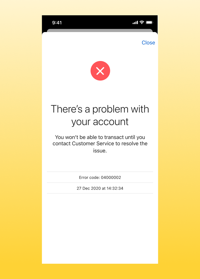
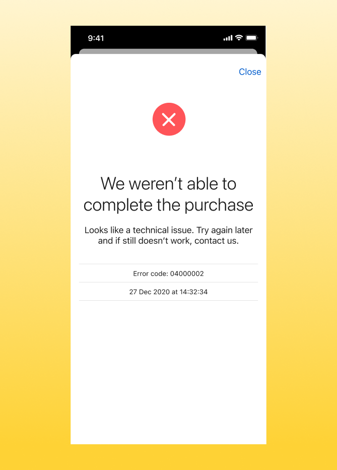
Error states that don't conflate failures
Observation
In financial products, "something went wrong" is not an error message. It is the beginning of a trust collapse. A user who receives an unhelpful error after trying to buy Bitcoin with their savings has lost confidence in the bank, not just the feature.
Decision
Each failure mode has its own screen, its own explanation, and its own error code for support escalation. A failed API call is separated from a compliance block, which is separated from a connectivity failure, which is separated from an account on debit hold. Language is plain: "We weren't able to complete the purchase. Try again later, or contact us on 0860 999 119."
Trade-off
Mapping every failure state separately added significant design and content scope. The alternative, a single generic error screen, would have been faster to build and catastrophically worse for user trust in a financial context.
Solution
Every screen, every state. Inside the bank.
The product covers every step from first exposure to completed transaction. Paxos runs underneath. The user sees TymeBank, all the way through.
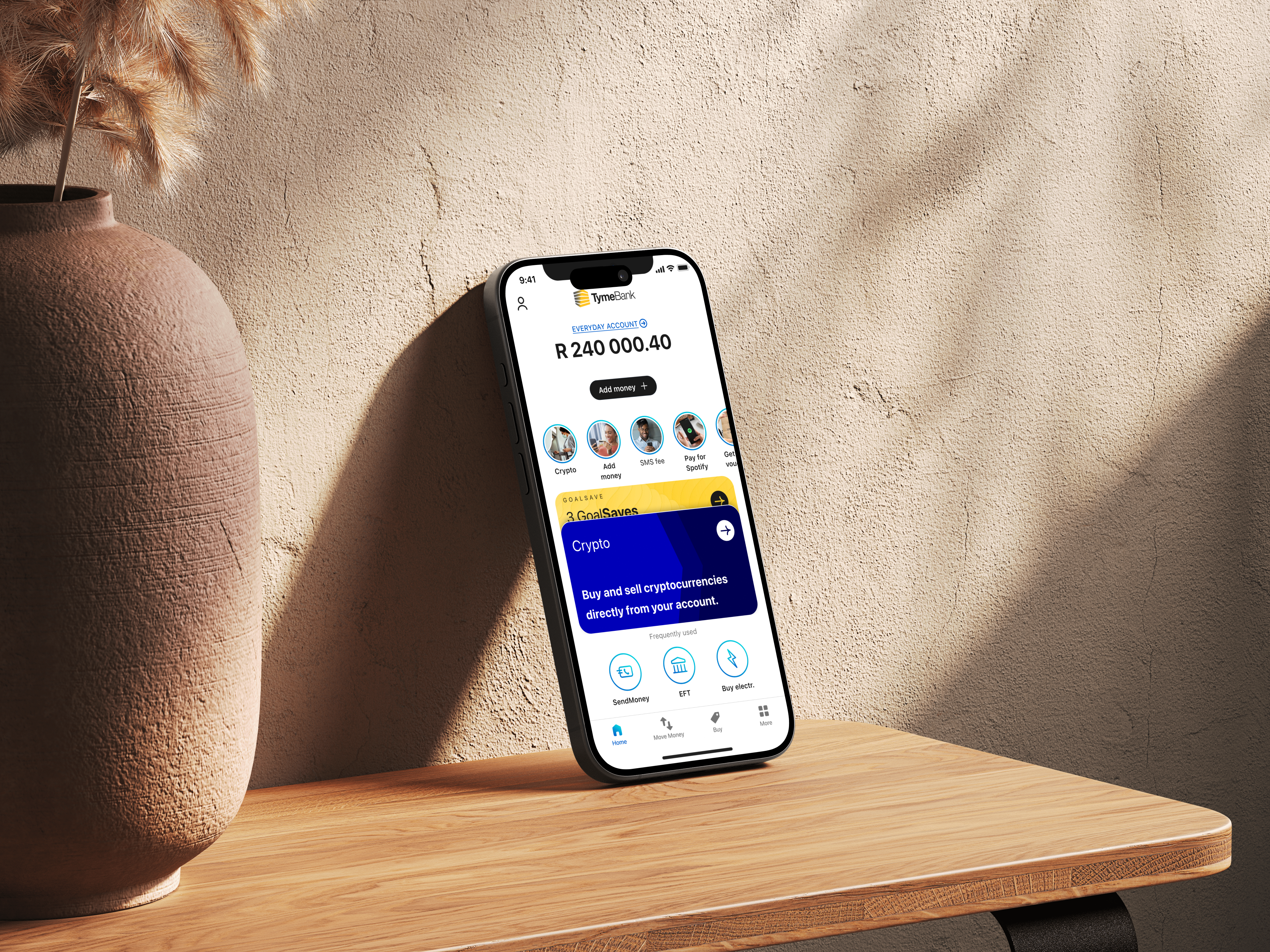
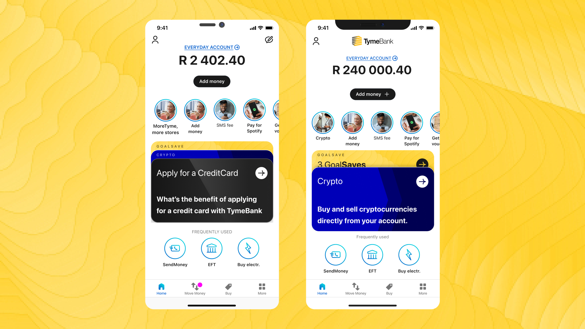
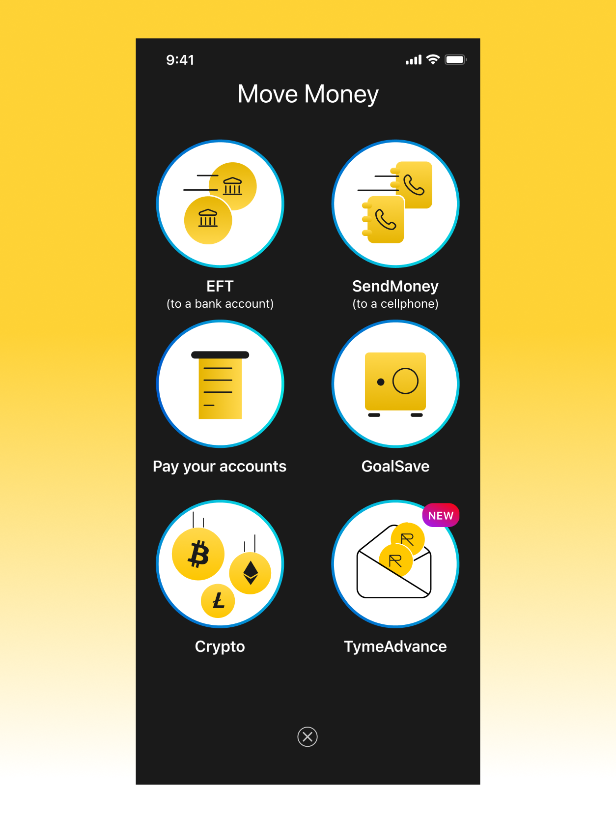
Discovery
Crypto sits inside the Move Money menu alongside familiar actions like EFT, SendMoney, and GoalSave. It is one of six options, not a banner, not a push notification. Users discover it naturally while doing something they already do.
Why not more prominent: Crypto is an opt-in product. Placing it as one option among six keeps it visible without pressuring users who came to send money or pay a bill. The banking experience stays intact.
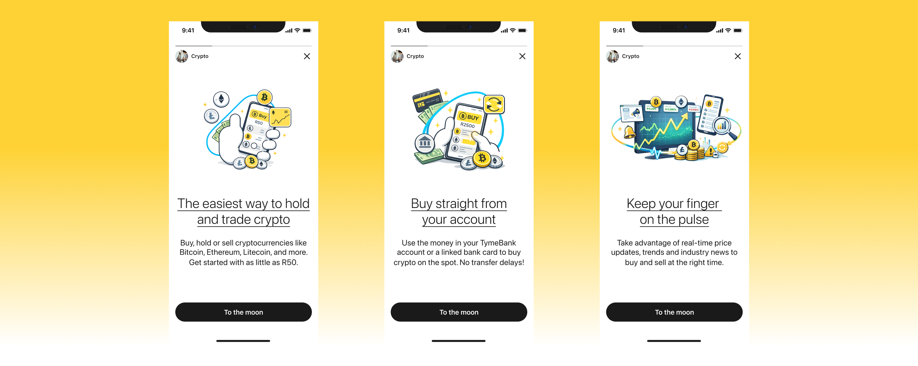
First-time experience
Three story cards cover the value proposition, funding method, and market data. The final screen captures T&C acceptance and eligibility before handing off to the coin list. Risk disclosure appears once, before the first trade, and never again.
Coin selection and detail
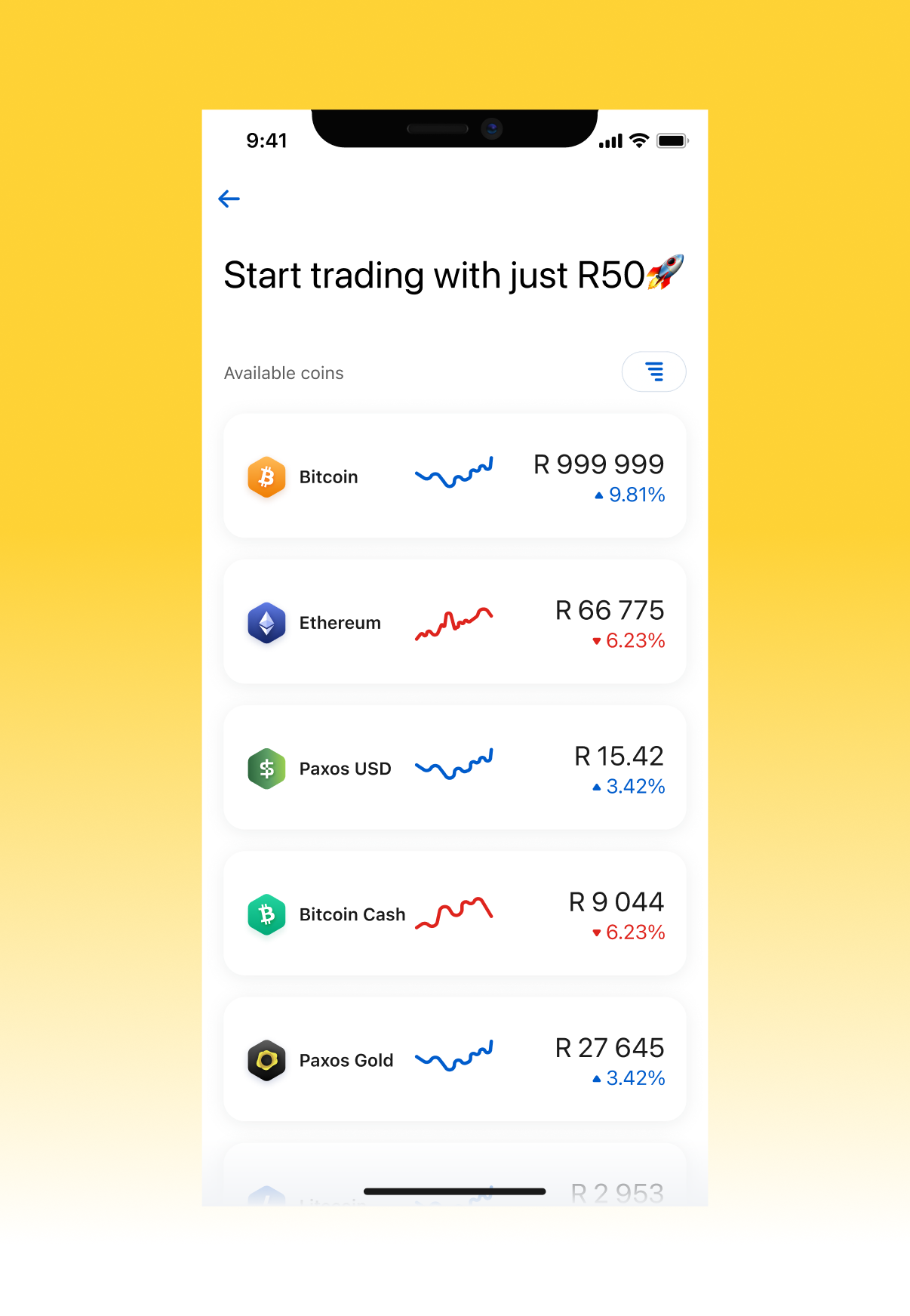
The coin list shows Bitcoin, Ethereum, Litecoin, Bitcoin Cash, Paxos USD, and Paxos Gold. Each row displays the coin's current ZAR price, a mini sparkline, and the percentage change at a glance: enough to decide whether to look closer.
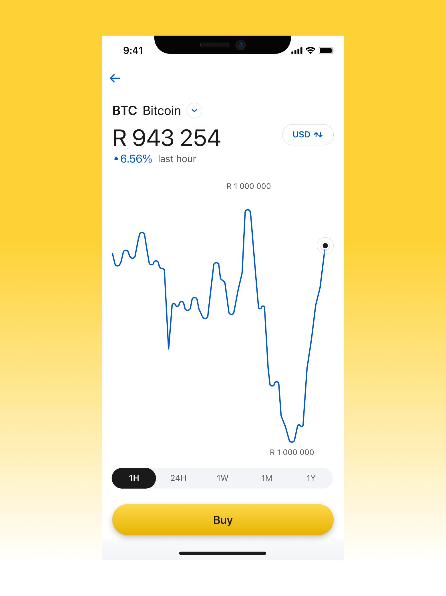
Tapping a coin opens the detail view: a price chart with 1H / 24H / 1W / 1M / 1Y timeframes, a USD toggle, percentage change relative to the selected window, and a brief "About" section for users who want context on the asset itself. The Buy CTA is persistent at the bottom.
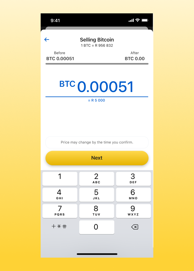
The buy flow
Users enter an amount in rand using a custom numpad. The balance bar, coin equivalent, and market price update live as they type. Validation is inline: empty state, minimum (R50), maximum, and over-balance, each with a specific, non-alarming message.
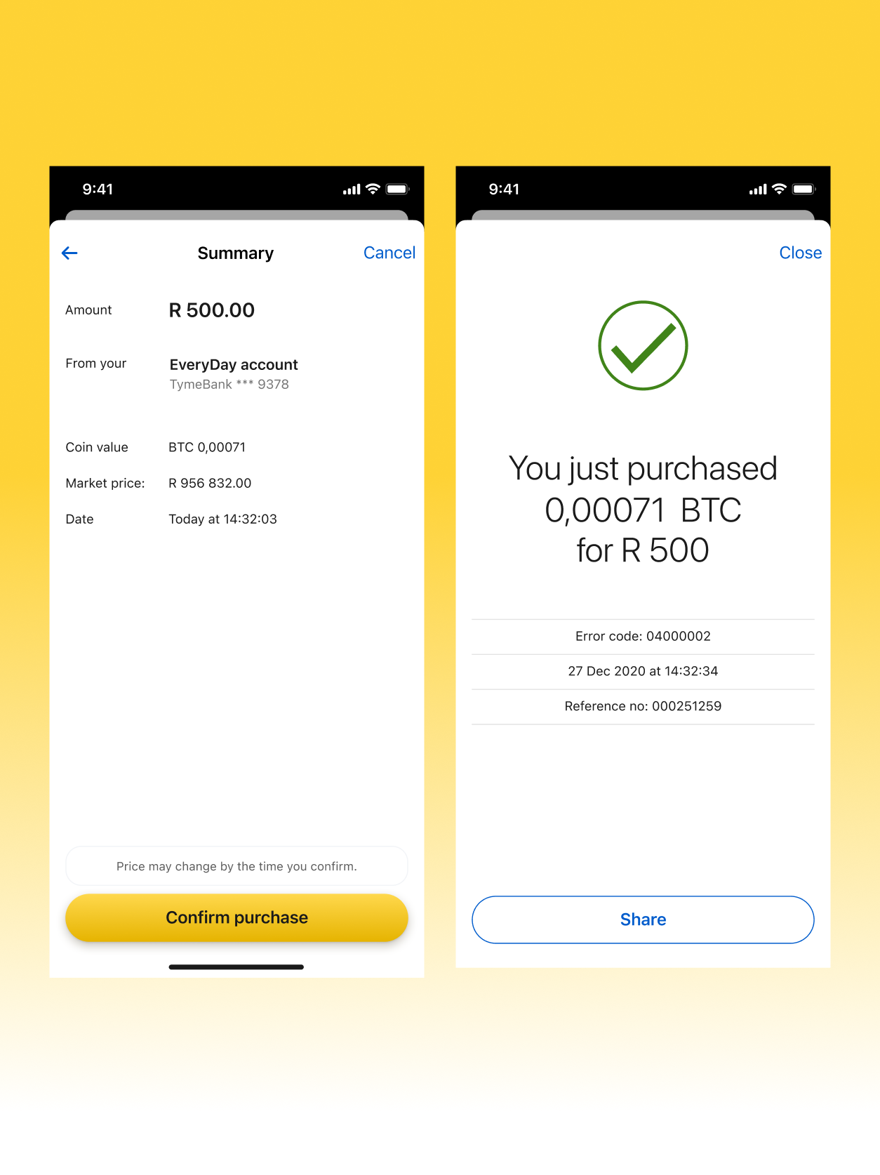
Confirmation and success
The summary screen shows: rand amount, source account (TymeBank EveryDay), coin value in BTC, locked market price, and timestamp. A final disclaimer before the "Confirm purchase" CTA. After confirmation, an animated success screen shows the final amounts received.
Key principle: The summary screen is a receipt, not a last-chance warning. All the relevant information is displayed, but the framing is confirmatory: this is what you are buying, this is where it comes from, this is the price.
Sell flow and error states
The sell flow mirrors buy with coin quantity as the input. Each failure mode, from API errors to compliance blocks, has a dedicated screen with plain-language explanation and error code for support.
Outcome
South Africa's first. Built into the bank, not bolted on.
Market
1st
Licensed South African bank to offer native in-app crypto trading
Accessibility
R50
Minimum entry. Lower than any standalone SA crypto exchange at launch.
Breadth
6
Coins available at launch across BTC, ETH, LTC, BCH, USDP, PAXG
Abstraction
0
Paxos surfaces visible to the user. Full TymeBank experience, end to end.
What the Launch Proved
The product launched as a pilot with a controlled cohort before broader rollout. The primary signal was first-purchase completion rate. Not portfolio size. Not trading volume. The R50 minimum and ZAR-first interface were intentional bets on a first-buy market, not an active-trader market.
What the Paxos Integration Enabled
Building on Paxos infrastructure meant TymeBank didn't need to build its own custody layer, settlement system, or compliance engine. This compressed the time to launch and removed regulatory risk from the product team. The design challenge was making a three-party arrangement (user, TymeBank, Paxos) feel like a two-party transaction.
Reflection
Trust is not a feature you add. It's the architecture.
What Worked
Treating the amount screen as the primary trust surface was the right call. The balance bar, live pricing, and ZAR-first denomination all served a single question: "What happens to my bank account?" Answering that at the point of commitment mattered more than any educational onboarding.
What Stayed Hard
Indicative pricing is hard to communicate without sounding evasive. The disclaimer "Price may change by the time you confirm" is accurate but unsatisfying. In a regulated banking environment, users expect the number they see to be the number they pay. This is a structural feature of crypto settlement, not a design failure. Explaining that in two lines without creating anxiety remains an unsolved problem.
What I'd Explore Next
A portfolio view with P&L over time. The design accommodated it in Phase 2 but it didn't ship with the pilot. For users who make a first purchase, seeing their holding grow or shrink relative to their buy price is the thing that converts them from first-buyers to active users.
Price alerts and recurring buys (rand-cost averaging) were also on the product backlog. Both are high-value for a market where many users are paid monthly and want to participate systematically rather than reactively.
What This Changed in My Thinking
Designing financial products in a regulated environment is designing for the distance between what users understand and what they need to feel certain about. Every information hierarchy decision, every default, every word choice either builds or erodes the confidence that makes someone willing to put real money into something new. The compliance requirements weren't obstacles to the product. They were the reason the product could exist in the first place.
Prototype
Walk through the flows
Three interactive prototypes covering the core journeys: onboarding and first purchase, portfolio management, and the sell flow. Click through each to experience the trust architecture in action.
Flow 1 — Onboarding & First Buy
TymeBank Crypto — Onboarding & First Buy
Loading prototype...
Click through the prototype to experience the full matchmaking flow
Flow 2 — Portfolio & Holdings
TymeBank Crypto — Portfolio & Holdings
Loading prototype...
Click through the prototype to experience the full matchmaking flow
Flow 3 — Sell Flow
TymeBank Crypto — Sell Flow
Loading prototype...
Click through the prototype to experience the full matchmaking flow